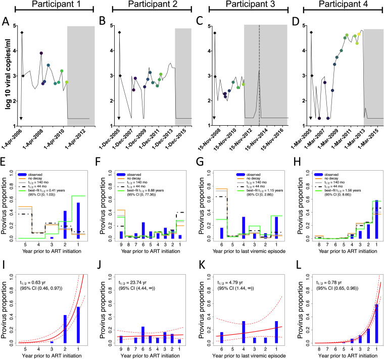
FIG 8.
Pre-ART proviral decay rate estimates. (A to D) Viral load histories, with engrafted “peak viremia” kinetics from the literature (shown as black diamonds), for participants 1 (A), 2 (B), 3 (C, where the dotted line represents the viremic episode after ART that serves as the reference point in this analysis), and 4 (D). (E to H) Phylogenetically determined proviral ages and predicted proviral age distributions under different rates of proviral decay for participants 1 to 4. Blue histograms denote the proportion of each participant’s distinct proviruses that dated to each year prior to ART initiation, data that are derived from the integration date point estimates in Fig. 3D, 4D, 5D, and 6D, respectively. The yellow line indicates each participant’s model-predicted proviral deposition. The gray and dashed black lines predict what the proviral age distributions would be at the time of sampling had proviral decay subsequently occurred under half-lives of 140 or 44 months following deposition (these half-lives represent published on-ART estimates of total DNA [26] and replication-competent reservoir [25] decay, respectively). The green line represents the model-predicted proviral age distributions under the pre-ART proviral decay rate that best fit each participant's observed data. (I to L) Best-fit half-lives estimated directly from each participant’s observed proviral age distributions using a Poisson generalized linear model (red line) along with 95% confidence intervals (dotted lines).

