
Fig. 3. Antigenic dynamics of Thailand DENV1–4 strains isolated between 1994 and 2014.
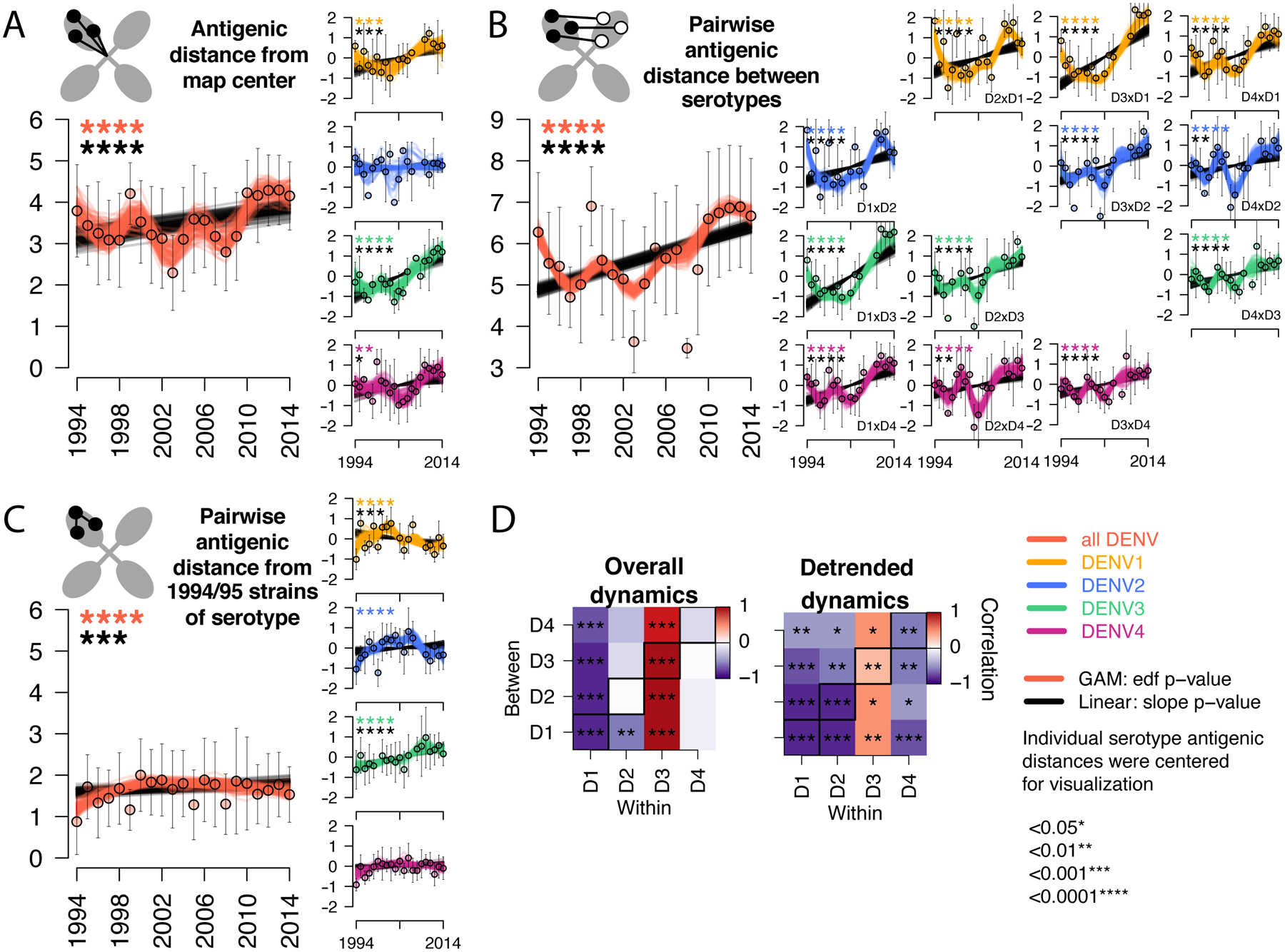
Antigenic change over time for all serotypes, measured as (A) distance from the map center, (B) pairwise distance between serotypes each year, (C) pairwise distance from 1994–1995 strains of the same serotype. Cartoons depict each antigenic distance metric. For each antigenic time series, antigenic distances were bootstrap sampled (n=100) and used to construct 100 linear (black lines) and non-linear generalized additive (color lines) models. Mean and standard deviation of antigenic distances are shown as colored circles with black bars. Black stars indicate significant linear change (slope) while colored stars indicate statistically significant non-linearity (effective degrees of freedom). Models were run for all serotypes combined (with a variable to adjusted for serotype, large plots, y-axis shows measured distances) and for each serotype separately (vertical plots, y-axis shows distances centered at zero to facilitate comparison of relative change across plots). (D) Pearson correlation coefficients and corresponding p-values of bootstrapped (n=1000) within serotype (columns) versus between serotype (rows) overall antigenic dynamics (no adjustment) and detrended dynamics (linear model subtracted from the GAM prior to analysis). Diagonal black boxes correspond to distance from the map center, off diagonal indicates pairwise distance between serotypes. Color indicates correlation (range −1 to 1), while significance is indicated by stars.