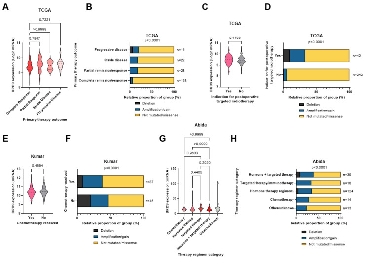
Figure 2.
BRD9 as a predictive biomarker in PCa in cancer omics cohorts. (A) Violin plot showing how BRD9 expression varies with primary therapy outcome in the TCGA cohort. p-values were obtained using Dunn’s post-hoc test. (B) Stacked bar chart showing BRD9 mutation distribution across primary therapy outcomes and the number of patients in each sample in the TCGA cohort. p-value was obtained via Fisher’s exact test using the Monte Carlo simulation. (C) Violin plot showing BRD9 expression in patients indicated for adjuvant radiotherapy (left) and those who were not (right) in the TCGA cohort. p-value was obtained using a Mann Whitney U test. (D) Stacked bar chart showing BRD9 mutation distribution in patients who were and were not indicated for adjuvant radiotherapy and the number of patients in each sample in the TCGA cohort. p-value was obtained using Fisher’s exact test. (E) Violin plot showing BRD9 expression in patients who received chemotherapy (left) and those who did not (right) in the Kumar cohort. p-value was obtained using a Mann Whitney U test. (F) Stacked bar chart showing BRD9 mutation distribution in patients who did and did not receive chemotherapy and the number of patients in each sample in the Kumar cohort. p-value was obtained via Fisher’s exact test using the Monte Carlo simulation. (G) Violin plot showing how BRD9 expression varies with therapy regimen in the Abida cohort. p-values were obtained using Dunn’s post-hoc test. (H) Stacked bar chart showing BRD9 mutation distribution in patients across therapy regimens the number of patients in each sample in the TCGA cohort. p-value was obtained using Fisher’s exact test. Regimen categories were combined as above due to small sample sizes (n) of various individual regimens. Y axis scales on violin plots vary due to experimental variation.

