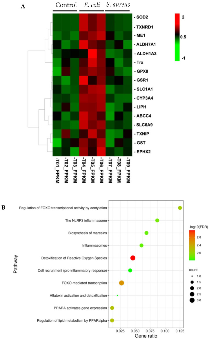
Figure 3.
Reactome pathway analysis. (A) Hierarchical clustering of gene expression for the 16 selected Nrf2 target genes. Rows represent individual genes and columns represent the expression changes of replicate for each investigated group. Red color indicates relative over-expression, while green color indicates relative under-expression. (B) Bubble plots displaying over-represented Reactome pathways. y-axis, functional pathways; x-axis, the gene ratio of enriched relative to all genes in each pathway. The size of the bubble is proportional to the number of genes assigned to pathway and the color corresponds to the adjusted p value. A high FDR is represented by red, and a low value is represented by green.

