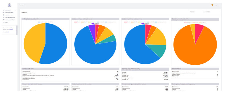
Figure 4.
The view of the screen for administration. The portal of the server back-end for doctors and other administrators provides useful interface for statistical data processing and interactions with the system. Pie charts from left describe percentage of active users within the last 72 h (from all registered users), types of monitored appliances in the active users (Spark lite, Spark full, Invisalign teen, Invisalign lite, Invisalign comprehensive, Invisalign first), types of monitored appliances in the non-active users, types of daily limits of removed aligners (over 120 min, within 120 min limit and under 15 min). On the Figure bellow there are visualized user statistics, average times for various habits, Average time per aligner or frequency of patient reports.

