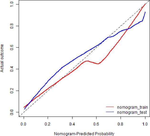
Figure 6.

Calibration curves of radiomics nomogram. The diagonal line represented the perfect prediction of the radiomics nomogram. The red and blue solid line represented the calibration curve of nomogram in the training and validation cohorts, separately. The calibration curves were close to the diagonal line, which indicated good prediction performance of the nomogram.
