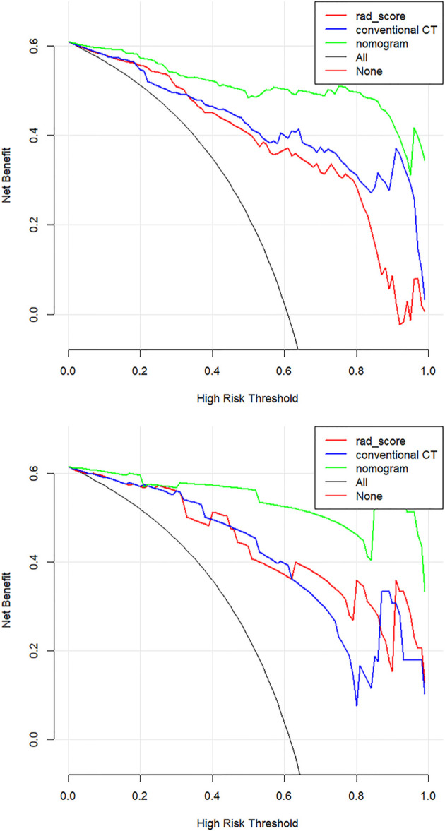
Figure 7.

Decision curve analysis (DCA) for the three models. The net benefit versus the threshold probability was plotted. The x-axis represents the threshold probability, while the y-axis represents the net benefits. The sensitivity and specificity of the model are calculated at each threshold to determine the net benefit. The DCAs showed that the net benefits of the nomogram model (green line) were superior to the benefits of the conventional CT model (blue line) and the Rad-score based model (red line) with the threshold probability range from 0 to 1.
