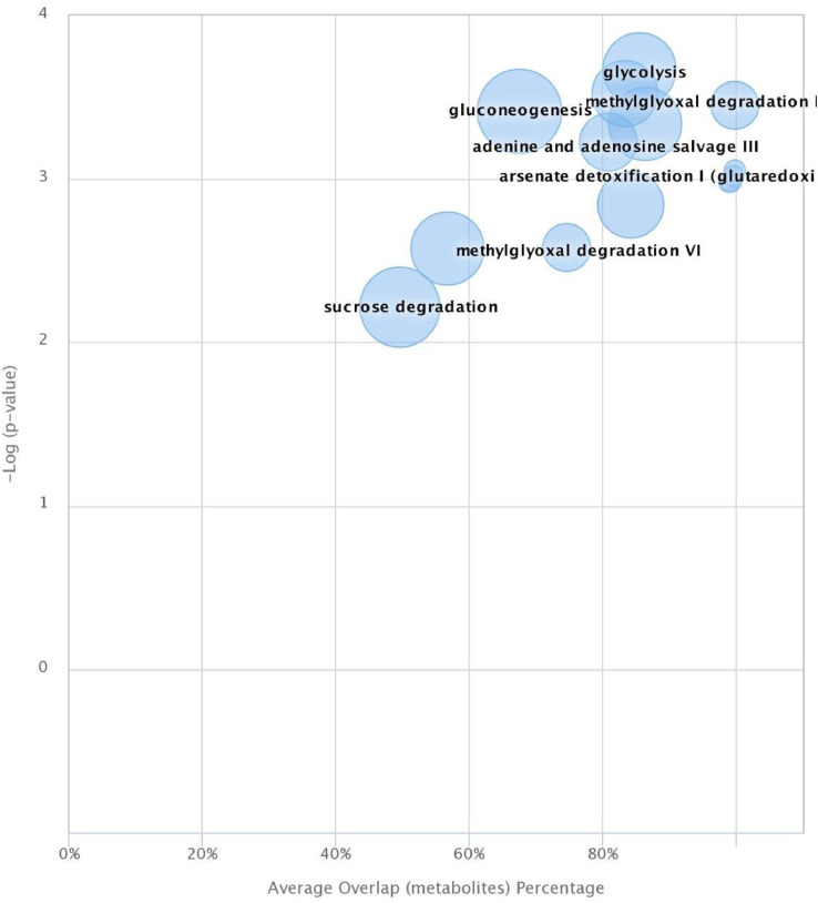
Figure 5.
Pathway cloud plot for control (low drip loss) vs. high drip loss. Plot focuses on P-value < 0.01 illustrating 11 dysregulated pathways. Each circle presents overlapping metabolite. Pathways are plotted as a function of pathway significance versus average metabolic pathway overlap. The radius of each circle represents the number of metabolites relative to the number of metabolites represented by other circles. Significantly dysregulated pathways appear in the upper right-hand quadrant of the plot.

