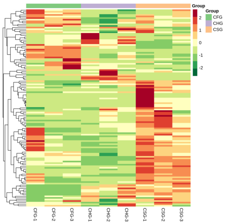
Figure 4.
Heatmap of differential metabolites. Metabolite clustering heatmap. The metabolite content data were normalized. Each sample is represented by a column and each metabolite by a row. Red bars indicate high abundance, while green bars indicate low relative abundance (color key scale next to heat map).

