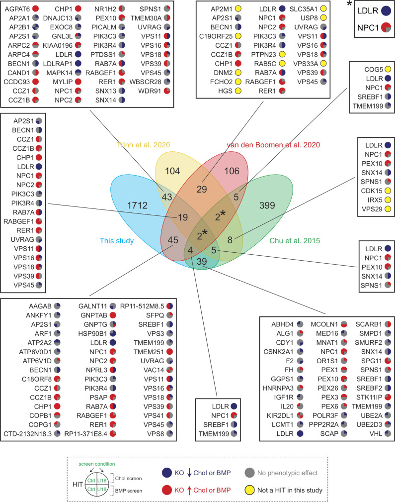
Figure S3.
Comparison of hits from four independent studies analyzing cholesterol homeostasis. The central Venn diagram displays overlaps in hits from the indicated referenced screens. Numbers in the nonintersecting areas indicate the number of hits identified in each study, whereas numbers in the intersecting areas correspond to overlapping hits between the different referenced screens. Specific gene hits from this screen are shown in adjacent boxes with colored circles according to an increase (red) or decrease (blue) in cholesterol or BMP. Genes that were identified here but only under one or another condition are shown with a gray circle; those not detected at all are highlighted with a yellow circle. Asterisks refer to LDLR and NPC1 genes (box on the top right). Chol, cholesterol; KO, knockout.

