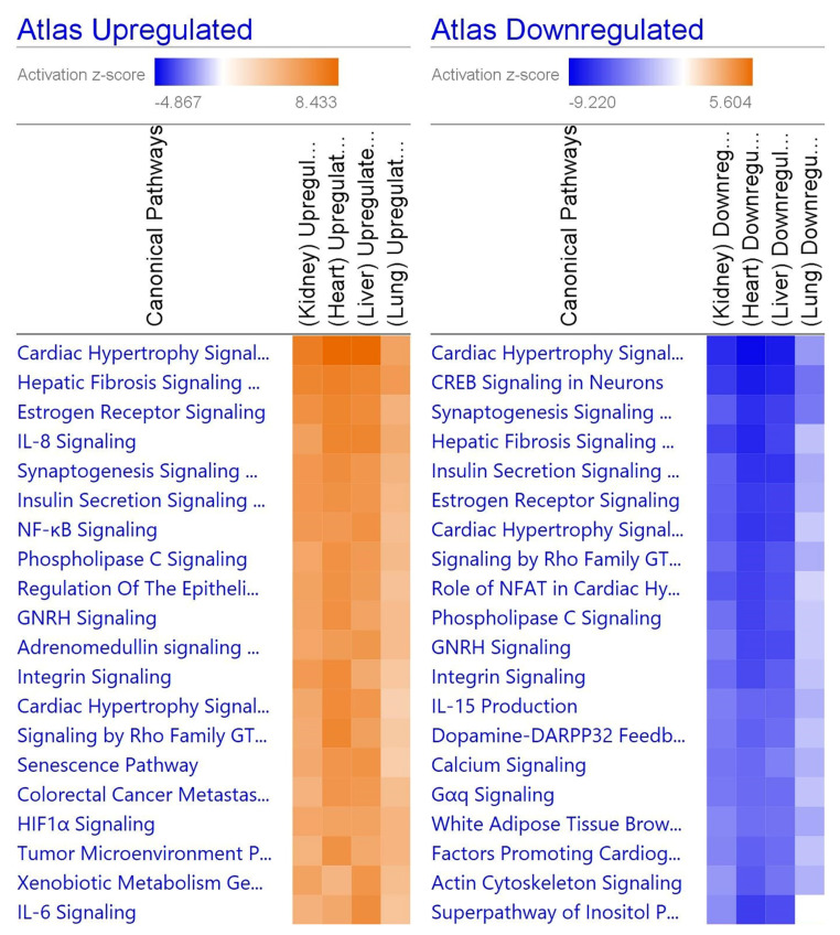
Figure 4.
Heatmap comparing the top 20 pathways in organs. Orange indicates upregulation while blue indicates downregulation, and a stronger color indicates a stronger effect. Gray indicates that the software was unable to predict the effect. The repeated pathways are due to individually down- or upregulated steps within the pathway. Generated in IPA from gene lists.

