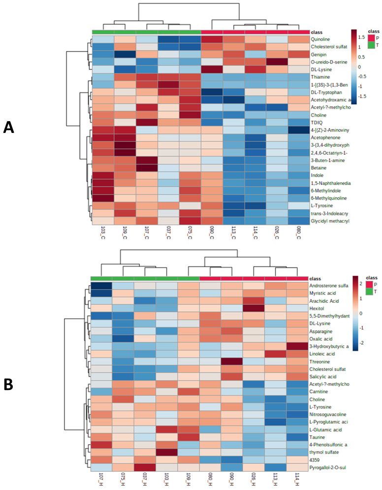
Figure 3.
Heat maps showed the distribution of top 25 metabolites that were significantly different between placebo and treated serum samples by C18 (A) and HILIC (B) analyses. The serum samples from placebo and treatment groups were labeled with red and green ribbons, respectively. The heatmap scale ranges from-2 to 2 in log10 (auto scaled intensities) scales (KEGG pathway metabolites).

