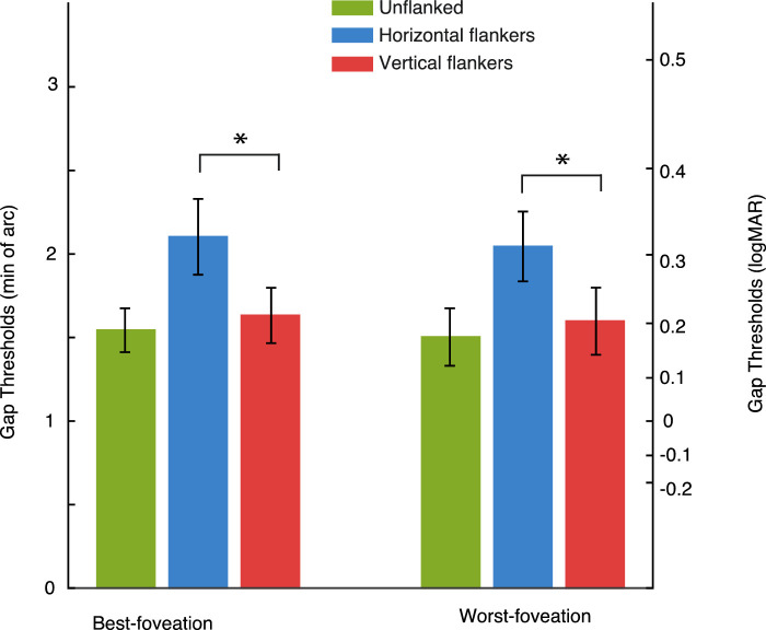
Figure 9.
Bar plot showing the average gap thresholds for the nystagmus participants split by best-foveation and worst-foveation trials. The data show similar thresholds for within best-foveation and worst foveation for all stimulus conditions. We plot a secondary y-axis to represent the logMAR equivalent, calculated by taking the logarithm of the mean values. A significant horizontal-elongation of crowding is seen in both best- and worst-foveation conditions. Green bars represent the unflanked stimulus condition, blue bars the horizontal flanked condition and red bars the vertical flanked condition, *= significant and ns = not significant, error bars represent the SEM.

