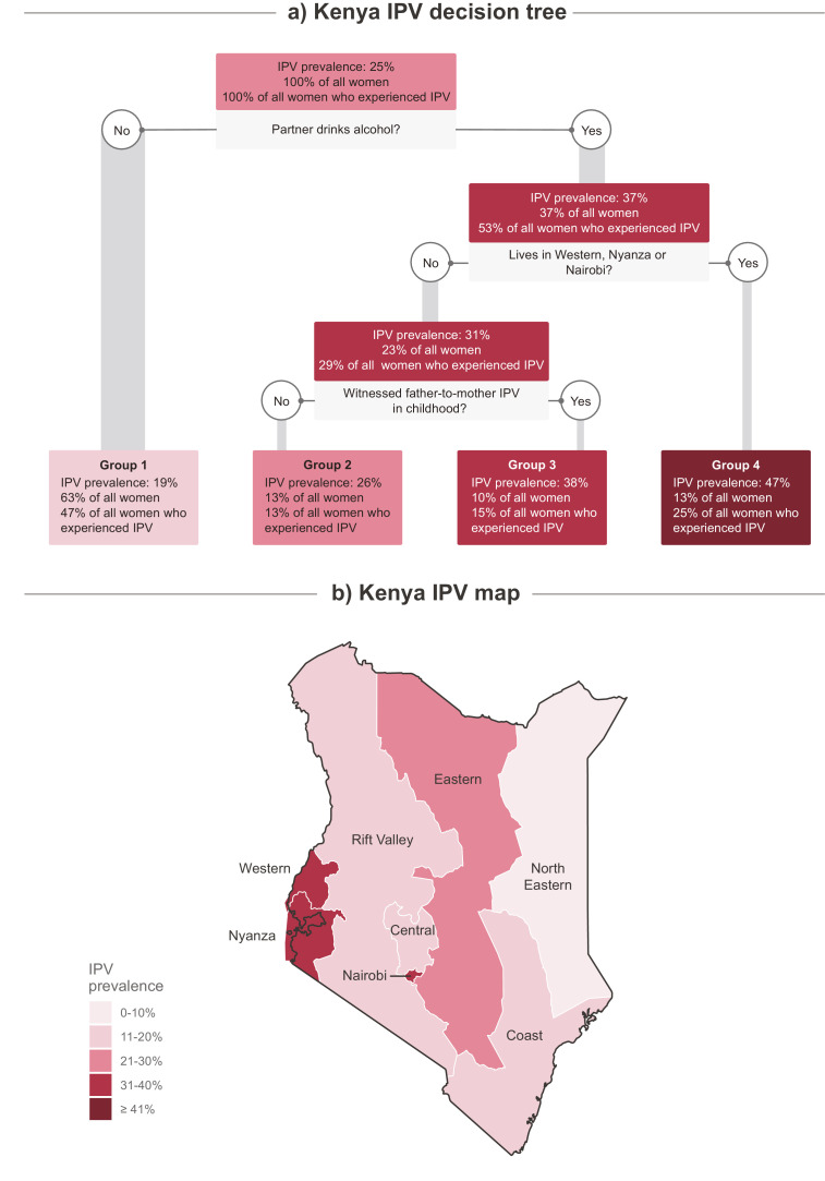
Fig. 3.
Kenya subnational variations in IPV levels.
The figure is divided in two panels: the top panel contains the Kenya's decision tree and the bottom panel an IPV prevalence map, showing subnational regions. Nodes in the decision tree and regions in the map coloured in lighter pink have lower IPV prevalence, while those in darker red have higher prevalence. For each node in the decision tree, the following are presented: (1) the IPV prevalence amongst the women assigned to that node; (2) the percentage of all women in the sample who were assigned to that node; and (3) the percentage of all women who experienced IPV in the sample who were assigned to that node. Grey boxes show the indicators used for splitting the group which they are directly below, as well as their respective cut off points.

