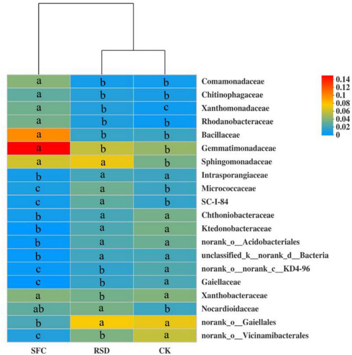
FIGURE 4.
Heat map displaying the average relative abundance of the top 20 bacterial families for all treatments. The key from blue to red represents the least abundant to most abundant in each row for a given family. The letters above the treatments indicate significant difference at p < 0.05 among treatments according to one-way analysis of variance (ANOVA).

