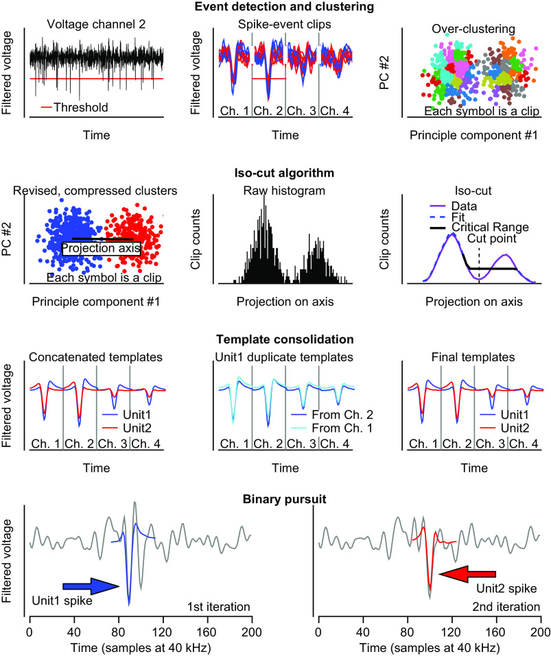
Figure 1.
Details of sorting procedure for each step of spike sorting pipeline. First row: detection of spike events, clips and clustering space. Left: filtered and zero-phase component analysis (ZCA) transformed voltage example for channel 2. Horizontal red line shows the spike event detection threshold. Middle: spike clips for threshold crossing events. Clips are taken separately for each of the 4 channels and concatenated across all channels. Only a subset of clips is shown for clarity. Right: principal component (PC) projection of all spike clips onto the first 2 PCs. The colored clips show the results of intentional overclustering. Second row: isocut algorithm. Left: clusters are compared pairwise with their nearest neighbor (final comparison shown). Data for each cluster are whitened and projected onto the line connecting their average centroids (black line). Middle: the projected PCs for the pair are converted into a one-dimensional histogram. Right: the actual data histogram is smoothed (purple) and a null distribution is formed using unimodal isotonic regression (dashed blue). The data and null distribution histogram bin counts are compared within the critical range (black) using a multinomial goodness of fit test. Third row: template consolidation across channels. Left: ground-truth templates used to create the artificial data set. Different color templates represent the average spike waveform for different units. Middle: due to noise, clips for unit 1 sometimes have maximal deviation on channel 1, and other times on channel 2, causing two different templates to be output, both of which correspond to unit 1. Right: the spike clips corresponding to unit 1 on channel 1 and channel 2 merge and so they are combined to form a single template for unit 1. Fourth row: binary pursuit template matching. Only data for channel 2 are shown for clarity. Left: first iteration of binary pursuit. Voltage trace (gray curve) showing overlapping spikes from unit 1 (blue arrow) and unit 2 (red arrow). Binary pursuit finds a maximal match for unit 1 template (blue curve) and adds a spike event to unit 1. Right: second iteration of binary pursuit. The voltage trace (gray curve) is the residual voltage trace after the template of unit 1 was subtracted during the first iteration. Red arrow indicates the remaining spike waveform of unit 2 that is identified and assigned correctly (red curve).

