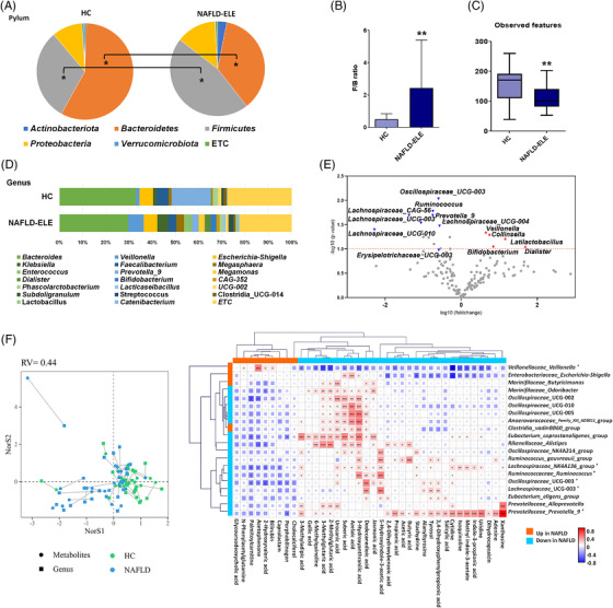
FIGURE 8.

Microbial community profiles of human in response to different diet type and microbial preventive therapy. (A) Pie charts of phylum distribution in human stool. The distribution of phylum was compared between healthy control (HC) (n = 22) control and non‐alcoholic fatty liver disease‐elevated liver enzyme (NAFLD‐ELE) (n = 25). *p < 0.05 (B) Firmicutes to Bacteroidetes ratio. (C) Box and whisker plot of Alpha‐diversity indices. *p < 0.05 and **p < 0.01 as compared between the NC and the NAFLD‐ELE groups based on Mann–Whitney U test. (D) Relative abundance of faecal microbiome at the genus level in HC and NAFLD‐ELE. (E) Volcano plot of stool microorganisms at genus level. The x‐axis presents log10 transformed fold‐change, and y‐axis presents ‐log10 transformed p‐value calculated by Student's t‐test. Red and blue colours present higher or lower abundance in NAFLD‐ELE compared to HC. (F) Co‐inertia analysis of metabolomic and taxonomic profiles. The x‐ and y‐axis present the first two vectors that most explain the variance composed with integrative metabolomic and taxonomic profiles. Circles and squares represent the faecal metabolome and microbiome, respectively. Green and blue‐sky colours indicate NC and NAFLD groups, respectively. Lines connect the faecal metabolome and microbiome from the same individual. The shorter the length of line is, the stronger the level of association is. (G) Co‐occurrence matrix of individual metabolite and microbial composition. The correlation structure consists of gut microbial feature (genus level) and the metabolic features that showed the significant alteration in the NAFLD patients. The correlation coefficient was calculated based on Spearman rank analysis. *p < 0.05, **p < 0.01, and ***p < 0.001
