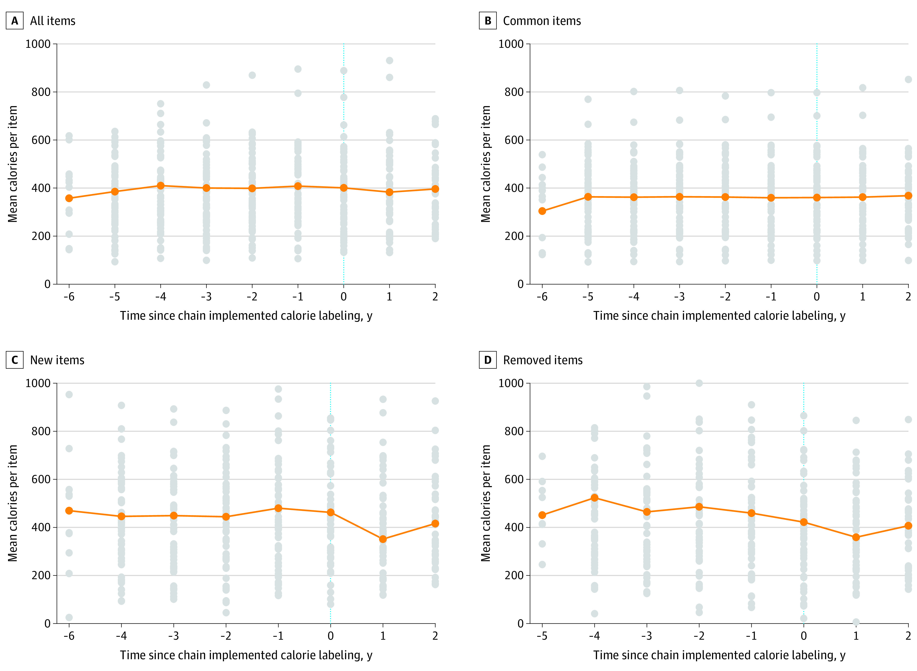
Figure. Mean Calorie Content of Menu Items Over Time.

A, All menu items. B, Common menu items. C, New menu items. D, Removed menu items. The graphs show the mean calories per item before and after menu calorie labeling. The mean calories per item for each individual restaurant are indicated by the gray dots, the mean calories per item across all restaurants are indicated by the orange dots, and the trend over time is represented by the orange line. The vertical dotted line indicates the time of implementation of labeling.
