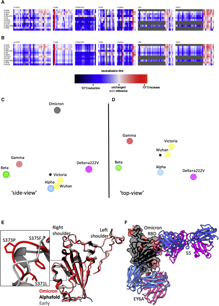
Figure 7.
Antigenic map from neutralization data for Omicron
(A) Neutralization data (log titers) showing sera as columns against challenge variants as rows. Sera are grouped into blocks according to the eliciting variant. The reference neutralization titer for each block is calculated as the average of all titers when challenged with the variant that elicited the serum. In the case of vaccine sera this was taken as the average of all best neutralization titers. Therefore, colors within a single block express the relative neutralization titer with respect to this reference.
(B) Shows an example of the equivalent model generated from one run of antigenic map refinement using the same reference offsets as calculated for (A).
(C) Shows a view of the three-dimensional antigenic map for variants of concern. The distance between two points corresponds to the drop-off in neutralization titer used in (B).
(D) Same antigenic space as (C) but rotated 90°, to look downward form Omicron.
(E) Overlay of the X-ray structure of Omicron (red) on the early pandemic (Wuhan) RBD (gray) and the predicted model of the Omicron RBD in black, drawn as cartoons. The structural change effected by the S371L, S373P, and S375F mutations is shown enlarged in the inset.
(F) X-ray structure of ternary complex of Omicron RBD with Beta-55 and EY6A Fabs. The Omicron RBD is shown as a gray semi-transparent surface with mutated residues in magenta. Fabs are drawn as cartoons, heavy chain in magenta and light chain in blue.
Related to Figures S1 and S6 and Video S1.

