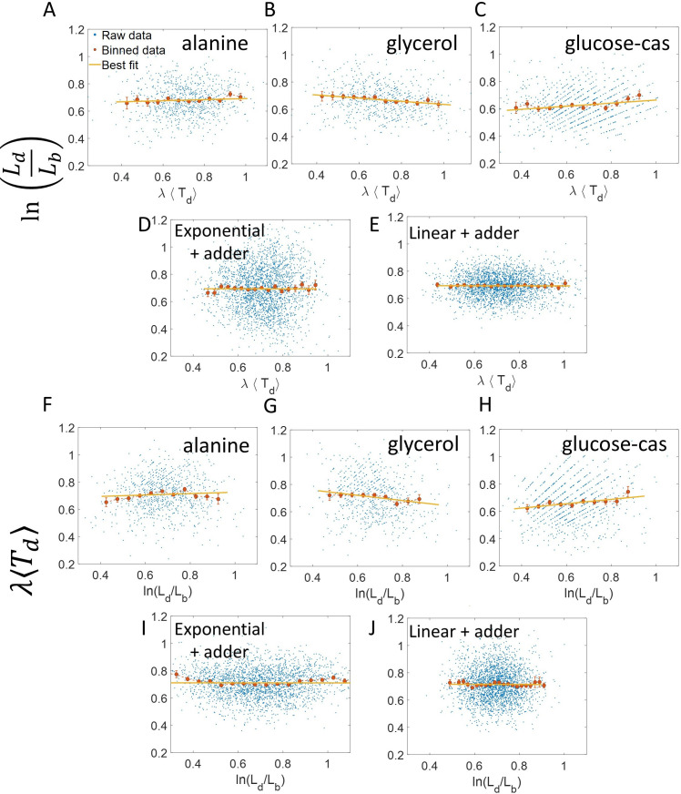
Appendix 2—figure 1. vs and its flipped axes plots.
(A-E) vs are shown for A. Experimental data in alanine medium. B. Experimental data in glycerol medium. C. Experimental data in glucose-cas medium. D. Simulations of the adder model where cells grow exponentially, carried out for N = 2500 cells. (E) Simulations of the adder model where cells grow linearly, carried out for N = 2500 cells. F-J. For the same order of the above experimental conditions and simulations, vs plots are shown. In all of the plots, blue represents the raw data, red represents the binned data, and the yellow line represents the best linear fit obtained by applying linear regression on the raw data. In all of the plots, the slope of the best linear fit is close to zero. Thus, we find that these plots are not a suitable method to differentiate between linear and exponential growth as they provide a similar best linear fit.

