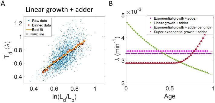
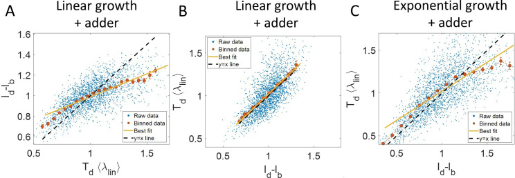
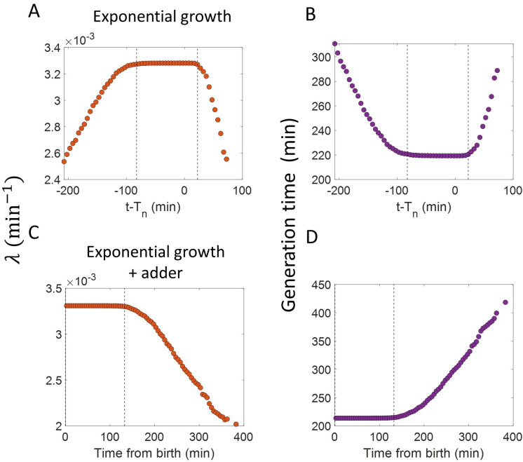
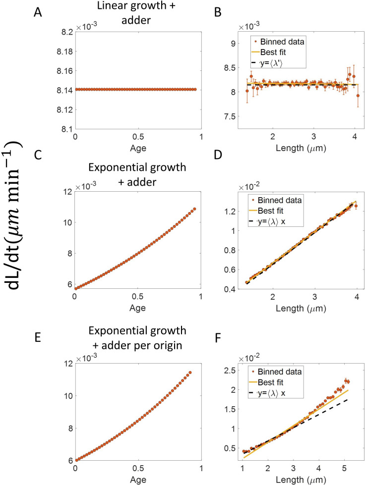
Figure 3. Differentiating linear growth from exponential growth.
(A) vs plot is shown for simulations of linearly growing cells following the adder model for N = 2500 cell cycles. The binned data (red) and the best linear fit on raw data (yellow) closely follows the y = x trend (black dashed line) which could be incorrectly interpreted as cells undergoing exponential growth. (B) The binned data trend for growth rate vs age plot is shown as purple circles for simulations of N = 2500 cell cycles of exponentially growing cells following the adder model. We observe the trend to be nearly constant as expected for exponential growth (purple dotted line). Since the growth rate is fixed at the beginning of each cell cycle in the above simulations, we do not show error bars for each bin within the cell cycle. Also shown as green squares is the growth rate vs age plot for simulations of N = 2500 cell cycles of linearly growing cells following the adder model. As expected for linear growth, the binned growth rate decreases with age as (green dotted line). The binned growth rate trend (shown as magenta diamonds) is also found to be nearly constant as expected (shown as magenta dotted line) for the simulations of exponentially growing cells following the adder per origin model. We also show that the binned growth rate trend (red triangles) increases for simulations of the adder model with the cells undergoing faster than exponential growth. The trend is in agreement with the underlying growth rate function (shown as red dotted line) used in the simulations of super-exponential growth. Thus, the plot growth rate vs age provides a consistent method to identify the mode of growth. Parameters used in the above simulations of exponential, linear and super-exponential growth are derived from the experimental data in alanine medium. Details are provided in the Simulations section.


