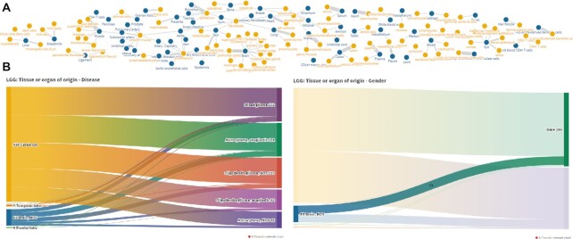
Figure 3.
Visualizations. (A) Interactive graph network relating tissues—organs and tissue subregions in samples included in miTED. Users may explore the graph and highlight nodes of interest, revealing most/least populated tissues and organs. (B) Interactive Sankey diagrams depicting relationships between ‘Tissue or organ of origin’ and Disease and ‘Tissue or organ of origin’ and Gender. On hover, users can explore the distribution of samples per category.

