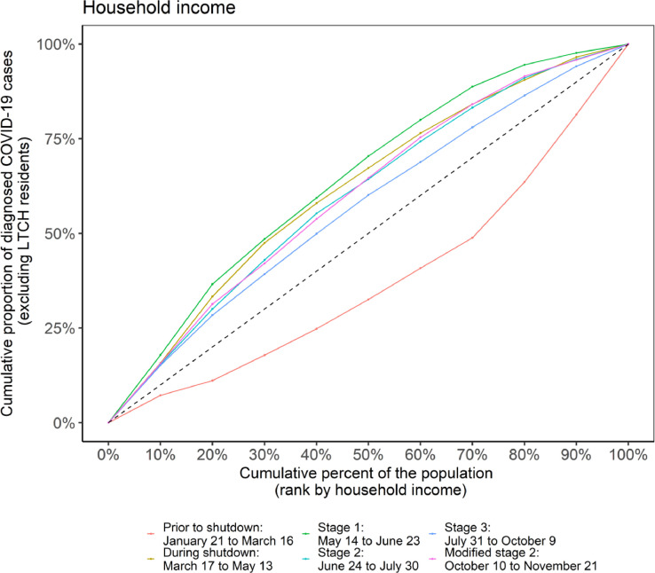
Fig. 4.
Lorenz curve and Gini coefficient of COVID-19 cases over time by income in Toronto, Canada (January 21, 2020–November 21, 2020). The dashed line is the line of equality. The colored solid lines represent the time-periods associated with the stages of intervention: prior to shutdown (January 21, 2020–March 16, 2020); during shutdown (March 17, 2020–May 13, 2020); stage 1 reopening (May 14, 2020–June 23, 2020); stage 2 reopening (June 24, 2020–July 30, 2020); stage 3 reopening (July 31, 2020–October 9, 2020); and modified stage 2 reopening (October 10, 2020–November 21, 2020). Income values described are per-person equivalent and after-tax. The number of cases were initially disproportionately lower in neighborhoods of lower income (light pink) before quickly concentrating in higher-income neighbourhoods. There was less heterogeneity at the beginning of the second wave in Stage 3 (dark blue), but the epidemic concentrated again quickly by neighborhood level income by the modified stage 2 (dark pink). (For interpretation of the references to color in this figure legend, the reader is referred to the web version of this article.)

