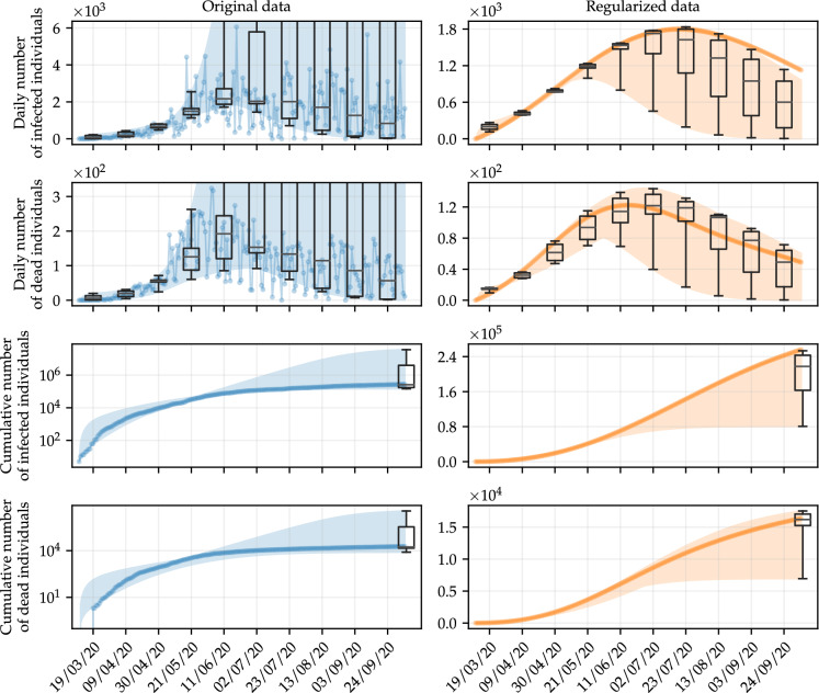
Fig. 4.
Simulations of the daily number of infected and dead individuals using optimal parameters obtained with the deterministic approach, by varying the amount of data in the training set. The shaded areas represent the variation range of the simulations, whereas the points are the fitted data. Box-and-whisker diagrams are used to show the variability of the simulations on specific days. We also show the corresponding results for cumulative data, where the noise is less effective, for comparison purposes. The results follow the same color scheme as in Fig. 2, blue for original data, and orange for regularized data. (Color figure online)

