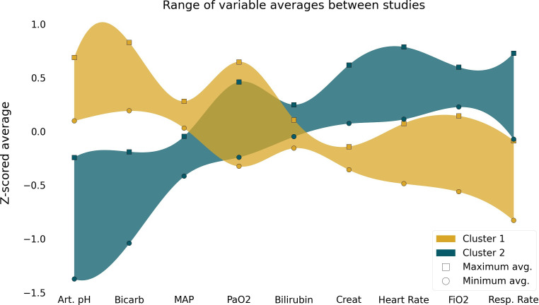
Figure 1.
Differences of the variables included in the cluster algorithm among clusters. Square symbols represent the study with the highest mean z score for each phenotype; circles represent the study with the lowest mean z score for each phenotype. The coloured bands are exclusively to help visualise the opposite trends of the variables on the different clusters; Art.pH, arterial pH; Bicarb, bicarbonate; MAP, mean arterial pressure; Creat, creatinine; Resp.Rate, respiratory rate.

