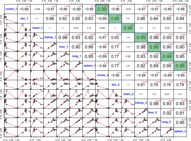
Figure S1. Correlations between pairs of the 14 samples (two biological replicates of the seven tissues/cell lines).
The lower triangle shows the scatter plots of percent spliced in of sample pairs, and the upper triangle shows Pearson’s correlation coefficients of sample pairs. Correlation coefficients between replicates in each tissue/cell line are highlighted in green. The lower correlation between two replicate ES samples is likely due to the fact that the two samples are from two distinct ES clones.

