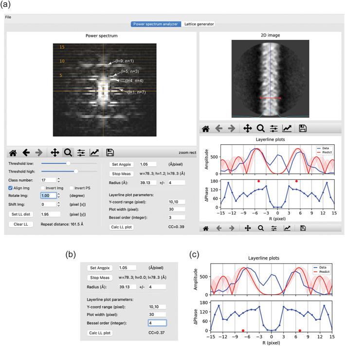
FIGURE 2.

The “power spectrum analyzer” tab. (a) Overview of the user interface. One of the two‐dimensional (2D) class averages of the MAVS filament in the MRC stack format and its power spectrum are shown. The 2D image is centered and vertically aligned by checking the “align img” checkbox. The blue vertical line in the 2D image window serves as an indicator of the centering and alignment. The cyan curve represents the horizontal one‐dimensional (1D) profile of the 2D image, useful for finding the left and right boundaries of the helix when measuring the radius. Layer lines are drawn as dotted lines, with every fifth line labeled. The distance between layer lines is set to 1.95 pixel. The plots of amplitude and phase difference in the “layer‐line plots” window are generated with the parameters in the “layer‐line plot parameter” area. Note that the “Y‐coord range” should be specified in pixel, not the number of layer lines. The theoretical amplitude plot with Bessel order 3 (red) is shown for comparison. The range of radius of 4 Å specified in the ± input box is reflected by the semi‐transparent trace in the plot. The red dots indicate that the expected phase difference between the two peaks related by mirror symmetry along the meridian should be 180°. (b,c) The theoretical amplitude plot with Bessel order 4 matches the data plot reasonably well. However, the predicted phase difference is 0°, inconsistent with the data
