Figure 3.
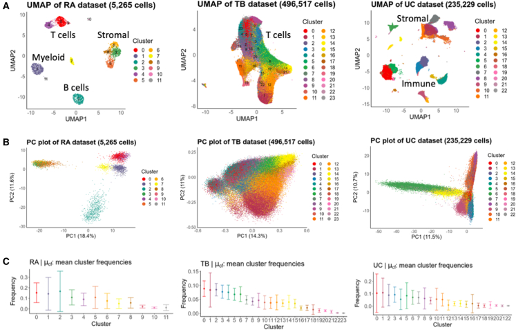
The RA, TB, and UC datasets feature a diverse set of cell types, PC structures, and cluster frequencies
(A) UMAP visualizations of the RA, TB, and UC datasets colored by cluster.
(B) PC plots of each datasets highlight differences in PC structure, e.g., differing scale of PC values.
(C) Frequency distributions for each cluster. Dots represent the observed mean frequency of that cluster across all samples in their respective dataset. In all panels, error bars represent 1 SD from the mean in each direction to showcase the spread of frequencies across samples.

