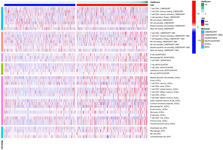
Figure 7.
Differences in immune function between high-risk and low-risk populations were analyzed using a heatmap (based on CIBERSORT, ESTIMATE, MCPcounter, ssGSEA, TIMER algorithm). The low-risk group is represented by blue on the horizontal axis; While the high-risk group is represented by red on the horizontal axis. The vertical axis represents the immune cells. Various hues represent various software forecasting approaches.

