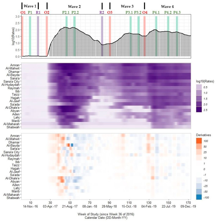
Figure 2.
A multi-panel plot of the national Yemeni cholera outbreak signature (top panel), a heatmap of rate values across 20 governorates (middle panel; excludes the Hadramaut and Socotra island governorate), and a heatmap of differences in rates or trivial derivative values (bottom panel). Cholera rates (cases per 100,000 persons, or cph) are presented as a spike plot using a log10-transformed scale for 172 study weeks (all missing data imputed with linear approximations). A smoothed time series line plot is superimposed on this spike plot, which was calculated using Kolmogorov–Zurbenko adaptive filters from Week 36 (4–11 September) of 2016 through Week 52 (23–29 December) of 2019. Smoothed rates (laboratory-confirmed cholera cases per 100,000 persons) were estimated using the best performing smoother. Vertical bars represent the onset timing (red) for each wave (O1, O2, O3, O4), the peak timing (green) including one peak for Wave 1 (P1), two peaks for Wave 2 (P2.1, P2.2) and Wave 3 (P3.1, P3.2), and three peaks for Wave 4 (P4.1, P4.2, P4.3), and the resolution timing (purple) for Waves 1 and 2 (R1, R2). The heatmap of rates uses a purple gradient scale (lighter hues ~0.0 cph and darker hues ~400 cph) while the heatmap of derivative values uses a diverging scale ranging from −100 (dark blue) to +100 (dark orange) with values near zero in grey. All plots share a common horizontal axis of time reported in weeks since Week 36 of 2016 (defined as study Week 0). Governorates are grouped by assigned outbreak clusters: the core outbreak (Sana’a, Sana’a City, and Al-Hudaydah), immediate neighboring I (Amran, Al-Mahwit, Dhamar, and Al-Bayda), immediate neighboring II (Raymah, Ibb, and Taizz), northern (Hajjah, Al-Jawf, and Sa’ada), southern (Al-Dhale’e, Abyan, Aden, and Lahj), and eastern (Marib, Al-Maharah, and Shabwah) clusters. Data used to develop this visualization are reported in Table 1 and Table 2 and Supplementary Excel Tables S3 and S4.

