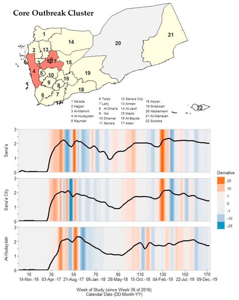
Figure 4.
A map of Yemen with a shaded outbreak cluster including Sana’a, Sana’a City, and Al-Hudaydah, and a stacked time series plot and heatmap for each governorate’s outbreak signature. Top panel: the governorate-level map indicates governorates within the cluster in orange, remaining governorates within our study in yellow, and excluded governorates in grey (the Hadramaut and Socotra island governorate). Bottom panel: stacked time series plots for each governorate within the cluster. All plots show log10-transformed smoothed rates produced using Kolmogorov–Zurbenko adaptive filters from Week 36 (4–11 September) of 2016 through Week 52 (23–29 December) of 2019. Smoothed rates (laboratory-confirmed cholera cases per 100,000 persons) were estimated using the best performing smoother. Backgrounds for each plot are heatmaps of trivial derivative values, ranging from −25 (dark blue) to +25 (dark orange) with values near zero in grey. Time series plots have a common horizontal axis of time reported in weeks since Week 36 of 2016 (defined as study Week 0). Data used to develop this visualization are reported in Table 1 and Supplementary Excel Table S5.

