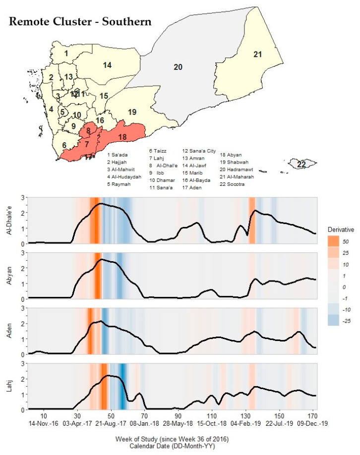
Figure 8.
A map of Yemen with a shaded outbreak cluster including Al-Dhale’e, Abyan, Aden, and Lahj, and a stacked time series plot and heatmap for each governorate’s outbreak signature. Top panel: the governorate-level map indicates governorates within the cluster in orange, remaining governorates within our study in yellow, and excluded governorates in grey (the Hadramaut and Socotra island governorate). Bottom panel: stacked time series plots for each governorate within the cluster. All plots show log10-transformed smoothed rates produced using Kolmogorov–Zurbenko adaptive filters from Week 36 (4–11 September) of 2016 through Week 52 (23–29 December) of 2019. Smoothed rates (laboratory-confirmed cholera cases per 100,000 persons) were estimated using the best performing smoother. Backgrounds for each plot are heatmaps of trivial derivative values, ranging from −25 (dark blue) to +50 (dark orange) with values near zero in grey. Time series plots have a common horizontal axis of time reported in weeks since Week 36 of 2016 (defined as study Week 0). All rates and trivial derivates were calculated for the 172 weeks of time series. Data used to develop this visualization are reported in Table 1 and Supplementary Excel Table S5.

