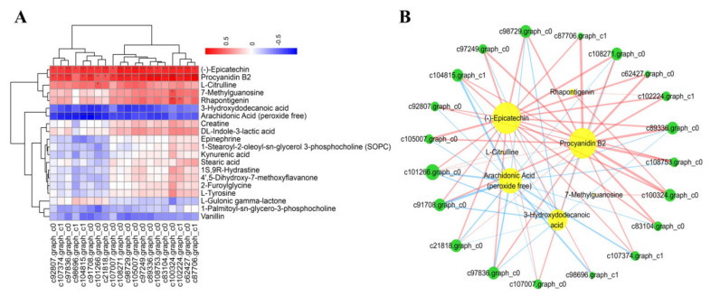
Figure 5.
Analysis of the correlation between the changes in levels of DEGs and DAMs. (A) Correlation heat map. Asterisks in the panels represent the significance of the correlation, with p-values of less than 0.001 (***), less than 0.01 (**), and less than 0.05 (*). (B) Associated network diagram created using Cytoscape. Lines colored in “red” and “blue” represent positive and negative correlations, yellow circles indicate metabolites and green circles indicate genes, p-value set at 0.05.

