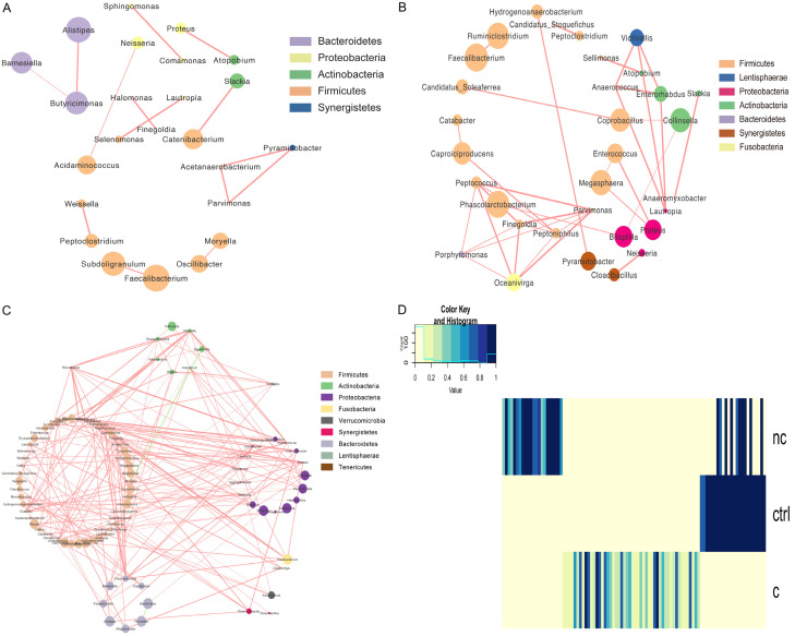
Figure 3.
Networks to visualize the interactions among the different genera in the three groups. A. Healthy controls. B. Non-constipated patients. C. Constipated patients. The density of the dashed line demonstrates the Pearson coefficient. The size of the node demonstrates the relative abundance. Red links represent positive interactions between nodes, green links represent negative interactions. D. An integration diagram of the three samples.

