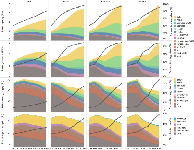
Fig. 3. Graphic of the power installed capacity (unit: TW), the power generation (unit: PWh), the primary energy mix (unit: EJ), and the final energy mix (unit: EJ) for the intermediate case in each scenario.
For the power installed capacity, the stacked area chart shows different power plant types, and the black line represents the proportion of the renewable energy contribution to the total capacity. For the power generation, the stacked area chart shows the annual power generation of different types of power generation technologies. The black line represents the proportion of renewable energy power generation to the total power generation. In the legend, the fuel names ending in CCS indicate power plants equipped with CCS, and otherwise indicate power plants without CCS. For the primary energy mix, the stacked area chart represents different types of primary energy supply, and the black line represents the renewable energy share. The calorific value calculation method is applied for primary energy statistics. For the final energy mix, the stacked area chart shows the end-use of different energy types, and the black line represents the electrification rate.

