
Figure 2.
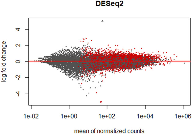
MA plot. The gene expression data visualised as a two-dimensional scatter plot of the log2 ratio of expression values between the two timepoints. MA plots show the log-fold change (y axis) (M-values, i.e. the log of the ratio of level counts for each gene between T1 and T0) against the log-average (x axis) (A-values, i.e. the average level counts for each gene across the samples). Each dot represents one gene, and the red colour indicates the 2138 genes identified to be differentially expressed between the two time points using a false discovery rate (FDR) of < 0.05.