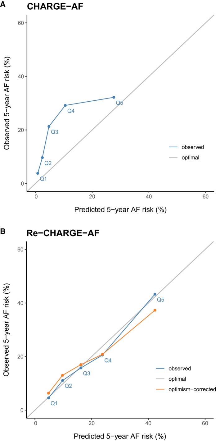
Figure 4. Calibration plots of observed 5‐year atrial fibrillation (AF) risk vs predicted 5‐year AF risk in quintile groups.

A, Depicts the plot of observed 5‐year AF risk (y‐axis) vs. predicted 5‐year AF risk (x‐axis) for the Cohorts for Heart and Aging Research in Genomic Epidemiology for Atrial Fibrillation (CHARGE‐AF) model in blue, while the optimal calibration is shown in gray. B, Depicts the plot of observed 5‐year AF risk (y‐axis) vs predicted 5‐year AF risk (x‐axis) for the fully refitted CHARGE‐AF (Re‐CHARGE‐AF) model in blue, the optimism‐corrected calibration plot in orange, and the optimal calibration is shown in gray.
