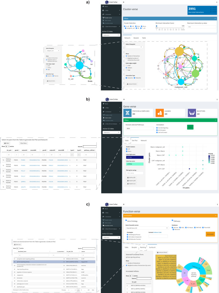
Fig. 2. Demonstration of InterCellar’s features concerning data exploration.
a Screenshot of InterCellar’s cluster-verse displaying a network of cell clusters. Filtering options are visible in the upper panel (cluster selection, minimum interaction score, maximum interaction p-value). In the lower panel, users can switch tabs among Network, Barplot, and Table. Network-specific customization options are available in the left panel as well as a download button to save the visualization. The network edges show the total number of interactions occurring between two cell clusters; all clusters are considered. The inset on the left-hand side shows a network generated by selecting malignant cells as viewpoint, with weighted numbers of interactions shown on the edges. b InterCellar’s gene-verse is captured in a screenshot. CellChat-specific filtering options are shown in the upper panel, while the lower one displays a dot plot of selected int-pairs chosen by the user in the table (shown in inset). All int-pairs annotated by CellChat to the “TGFb signaling pathway” were selected. Customization and download options are available in the left panel. c Screenshot of the InterCellar function-verse. The upper panel provides multiple annotation resources that can be included/excluded by the user. Once the functional annotation is performed, the selection of one annotated functional term from the Ranking table (shown in inset) triggers the generation of a sunburst plot (here, “tgf-beta signaling pathway” annotated from KEGG and Panther). Hovering on an outer section of the sunburst plot will show a panel listing all int-pairs enriched in the selected cluster-pair. A list of all int-pairs enriched is displayed on the left. In the same panel, the user can choose to generate the plot based on the total or weighted number of interactions. All visualizations are generated from CellChat-predicted CCI data of the melanoma dataset.

