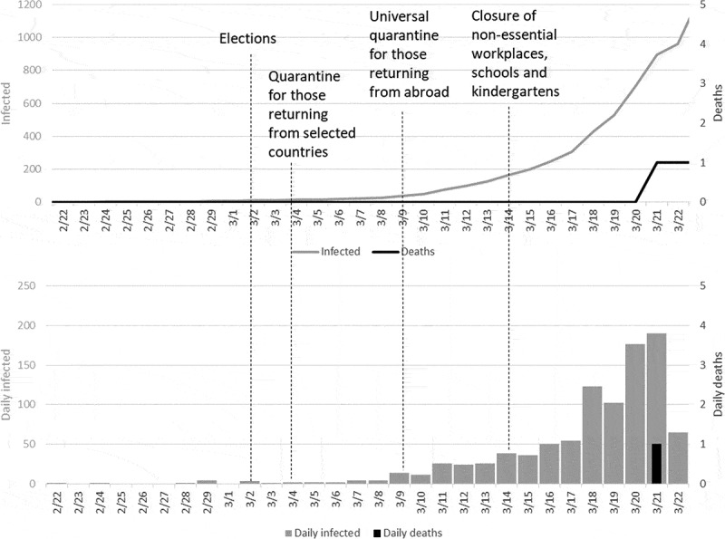
Figure 1.

The first month of the epidemic (since the first case) in Israel. The upper panel presents the accumulated number of infected cases (gray line) and deaths (black line); the bottom panel presents the daily increase in cases (gray) and deaths (black). Note that infection cases correspond to the gray Y-axis on the right, and the deaths correspond to the black Y-axis on the left.
