
Figure 2.
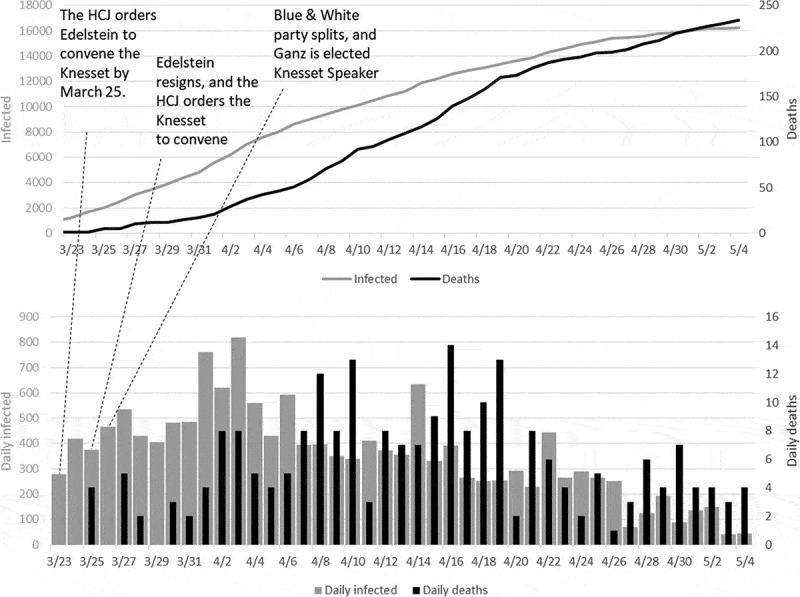
The apex of the epidemic in Israel (early days of April) and its decline. The upper panel presents the accumulated number of infected cases (gray line) and deaths (black line); the bottom panel presents the daily increase in cases (gray) and deaths (black). Note that infection cases correspond to the gray Y-axis on the right, and the deaths correspond to the black Y-axis on the left.