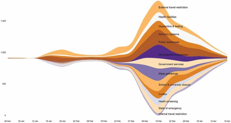
Figure 2.

Policy announcements over time.
The y-axis represents the number of policy announcements, offset around the middle of the range for ease of visualization. The x-axis represents time with week as the unit. The colour of each band represents a public health and safety theme in the response.
