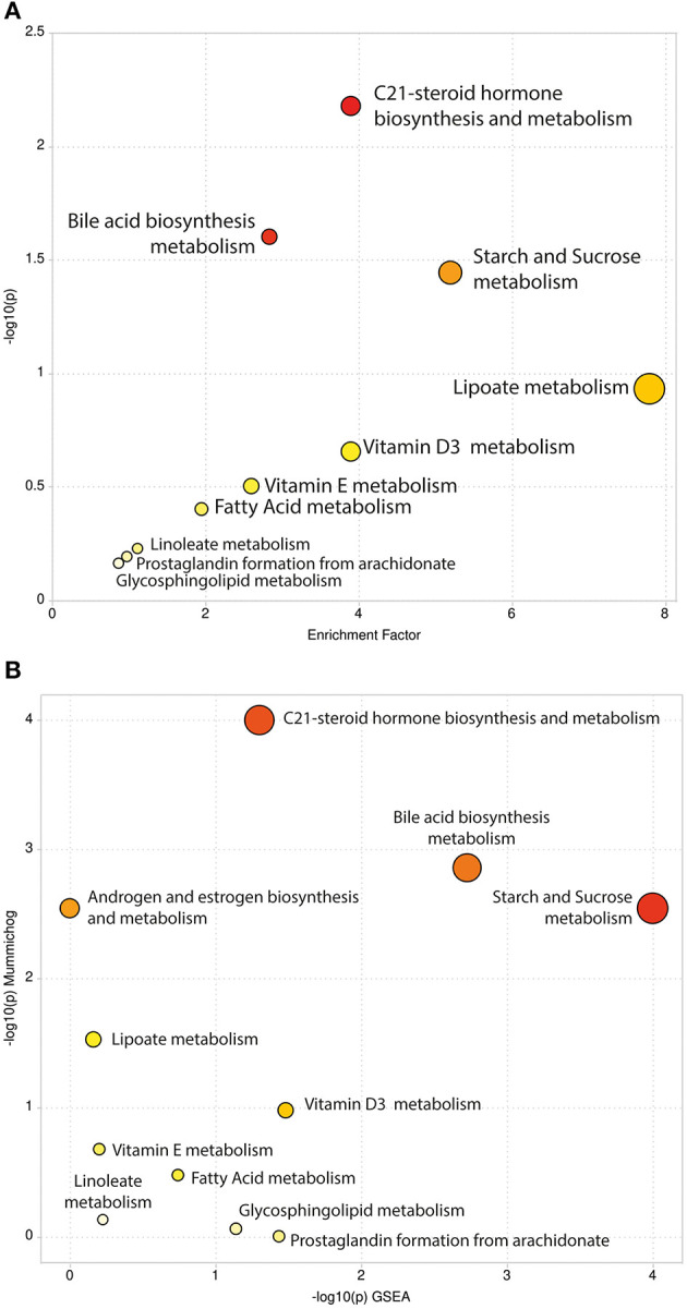
Figure 2.

Scatter Plots of Pathway Enrichment Analysis provided by mummichog (A) and by its integration with GSEA (B). The color and size of each circle correspond to its p-value and enrichment factor, respectively. Darker tones indicate more statistically relevant predicted pathways. The size of each dot represents the ratio between significant pathway hits and the expected number of compound hits within the pathways.
