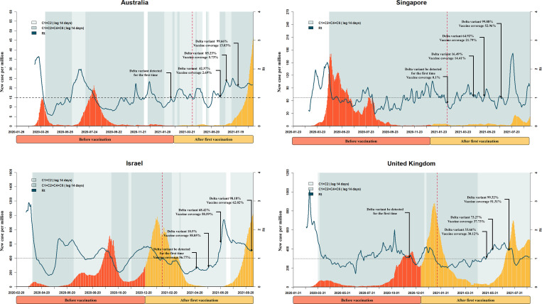
Fig 1. Key events during the progression of the pandemic in the Australia, Singapore, Singapore and United Kingdom.
The x axis represents time. The y axis represents daily new confirmed cases. The fluctuation line represents the effective reproductive number (Rt). The shading represents the implementation of a public health measure plus 14 days (lag time). The light-to-dark color shift indicates a gradual increase of stringency. The dotted vertical line represents the announcement of vaccination plus 40 days (lag time). Some key proportions of Delta variant and vaccine coverage are marked using dark arrows.

