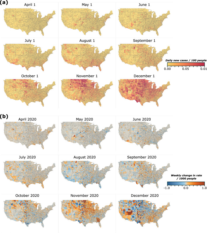
Figure 1.
Evolution of COVID-19 spreading in the continental US. (a) Average daily rate of new infections from April to December 2020 for the first week of the month at the county level. (b) Maps of the quantity XT(i), which corresponds to the change in the daily rate of infections between two consecutive weeks in the beginning of each month. Red color indicates an increase compared to the previous week and blue color indicates that the rate decreased.

