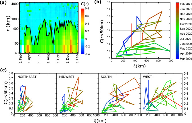
Figure 3.
Time evolution of the correlation function. (a) The value of the correlation function is shown as a function of the date (x-axis) and distance (y-axis). Red and green colors correspond to positive values while blue colors indicate negative values. The line that separates the two regimes describes the correlation length as a function of time. (b) The ‘trajectory’ of the epidemic is plotted by the values of local correlations C(r < 50 km) vs the correlation length, ξ, at different times for the entire country. (c) Same trajectory plots as in (b) for the four regions of US.

