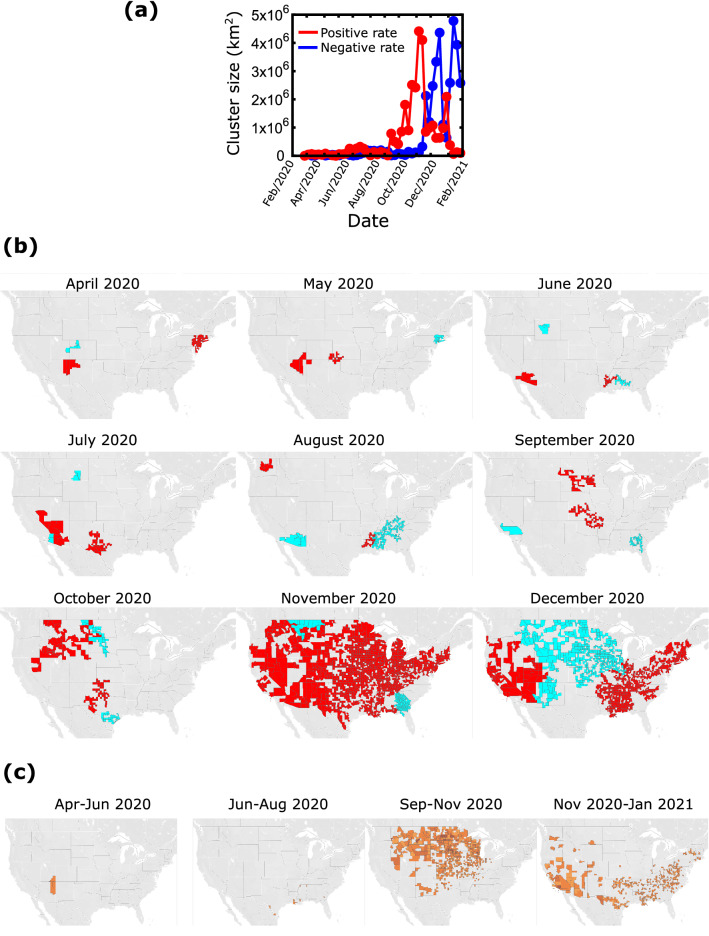
Figure 5.
Clustering analysis of the correlations (a) Total area of the largest clusters as a function of time. The red line corresponds to clusters of increasing number of cases and the blue line corresponds to clusters of decreasing cases. (b) The maps show the two largest clusters with positive rate (red) and the two largest clusters of negative rate (blue) at different times. (c) ‘Persistence’ maps. These maps show the counties which remained in positive clusters for more than half of the time period indicated on the map.

