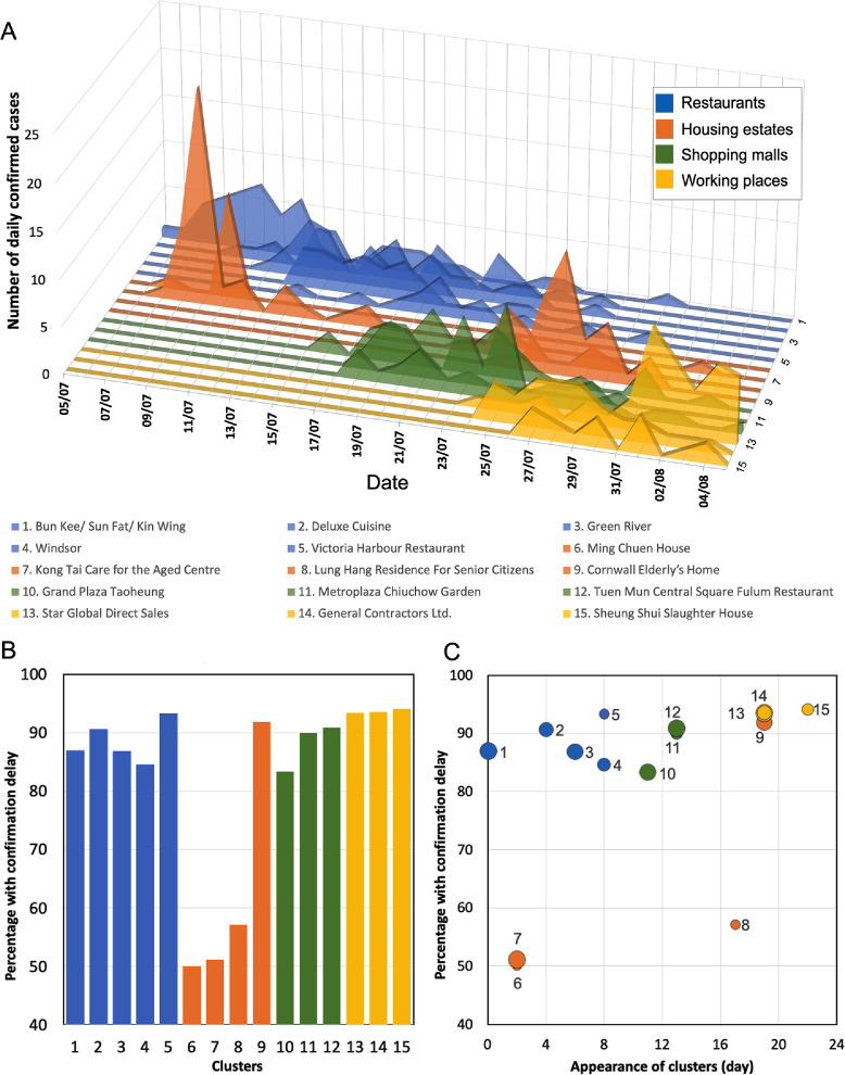
Figure 2.
Evolution of transmission clusters and occurrence of confirmation delay (i.e. infection confirmed after symptom onset). (A) Daily number of cases of each of the 15 large transmission clusters that emerged before the peak of the outbreak. The different classes of clusters are shown in different colours (see legend) (B) Percentage of total number of cases with confirmation delay in each transmission cluster. (C) The temporal trend in confirmation delay among these clusters. The ordinate shows the percentage of cases with confirmation delay in each cluster. Each point plots the time of appearance of a cluster, in days after the start of the outbreak. The area of each point is proportional to the total number of cases in the cluster.

