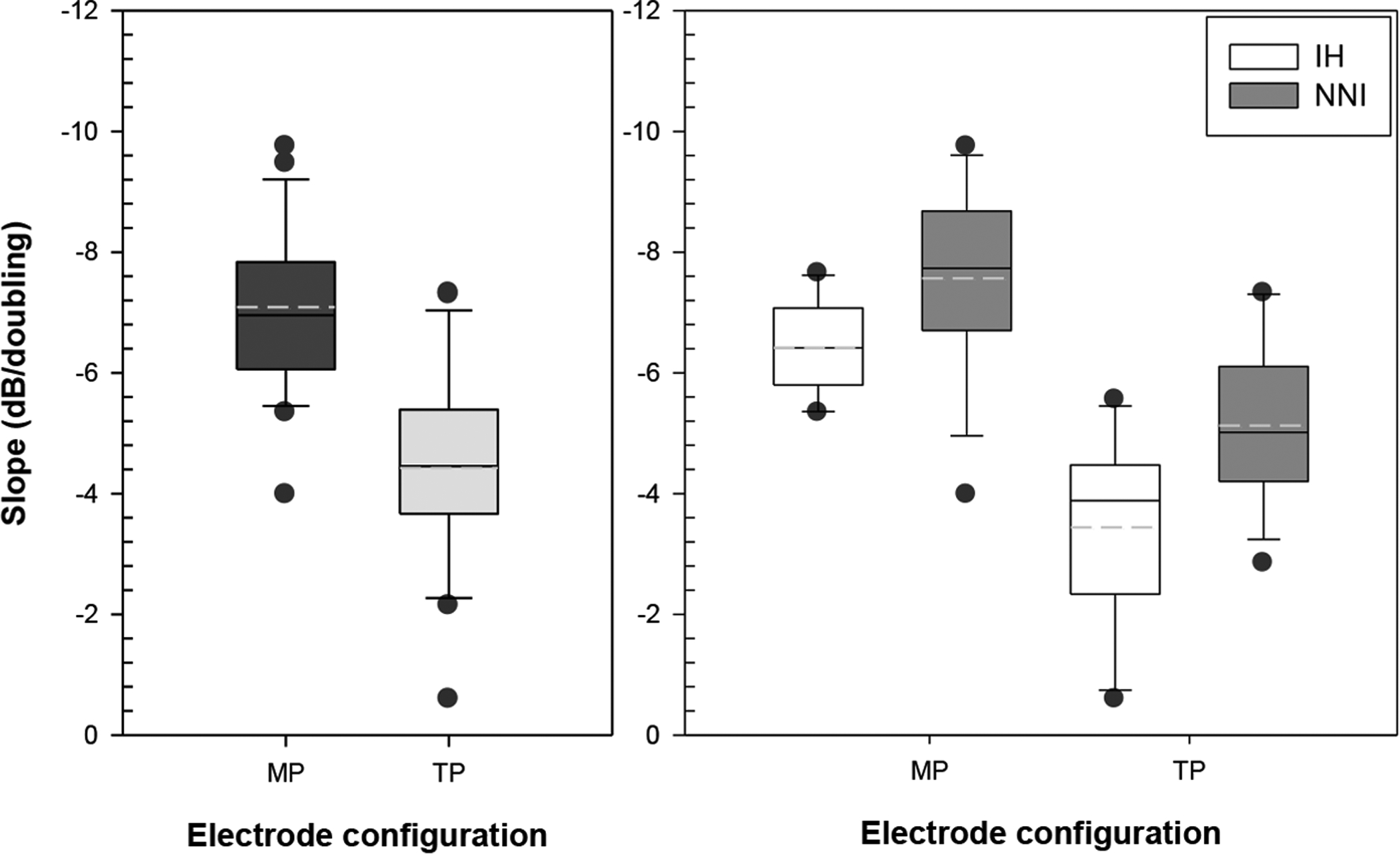
Fig. 2:

Slopes for the MP (dark bar) and TP (gray bar) electrode configuration are shown in the left panel. In the right panel, differences between treatment groups as a function of electrode configuration are shown; IH group are represented by white bars and the NNI group are represented by gray bars. In these graphs, the solid lines in the box represent the median and the dashed lines represent the mean. The upper and lower limits of the box plots represent estimates of the 75th and 25th percentiles and the upper and lower whiskers represents estimates of the 90th and 10th percentiles, respectively. The dark circles represent measures that fell outside the 90th and 10th percentiles.
