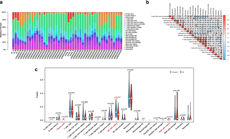
Fig. 6.
Immune infiltration landscapes in metadata cohort. a Bar plot shows the relative percent of 22 immune cell subpopulations in each individual. b Correlation heatmap of 22 immune cell subpopulations. Red and blue represent positive and negative correlation, respectively. The circle with a deeper color and larger fill area has a stronger correlation index. c Violin diagram displays different fractions of 22 immune cell subpopulations in IS and control samples. The red marks represent significant infiltrating difference of subpopulations

