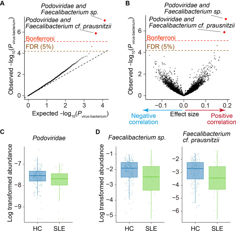
Figure 3.
Virus–bacterium coabundances in the gut microbiome. (A) A quantile–quantile plot of the p values from the virus–bacterium association analysis (P virus-bacterium). The x-axis indicates −log10(P virus-bacterium) expected from uniform distribution. The y-axis indicates the observed −log10(P virus-bacterium). The diagonal dashed line represents y=x, which corresponds to the null hypothesis. The horizontal red dashed line indicates the Bonferroni-corrected threshold (α=0.05), and the brown dashed line indicates the FDR threshold (FDR=0.05) calculated using the Benjamini–Hochberg method. The virus–bacterium pairs with p value of less than the Bonferroni thresholds are plotted as red dots. The virus–bacterium pairs with FDR of <0.05 are plotted as brown dots, and other virus–bacterium pairs are plotted as black dots. (B) A volcano plot. The x-axis indicates the effect sizes in linear regression. The y-axis, horizontal dashed lines and dot colours are the same as in (A). (C) Case–control comparison of the Podoviridae abundance for SLE. Boxplots indicate the median values (centre lines) and IQRs (box edges), with the whiskers extending to the most extreme points within the range between (lower quantile−(1.5×IQR)) and (upper quantile+(1.5×IQR)). (D Case–control comparison of the Faecalibacterium spp and Faecalibacterium cf. prausnitzii abundance for SLE. Boxplots indicate the median values (centre lines) and IQRs (box edges), with the whiskers extending to the most extreme points within the range between (lower quantile−(1.5×IQR)) and (upper quantile+(1.5×IQR)). FDR, false discovery rate; HC, healthy control; SLE, systemic lupus erythematosus.

